
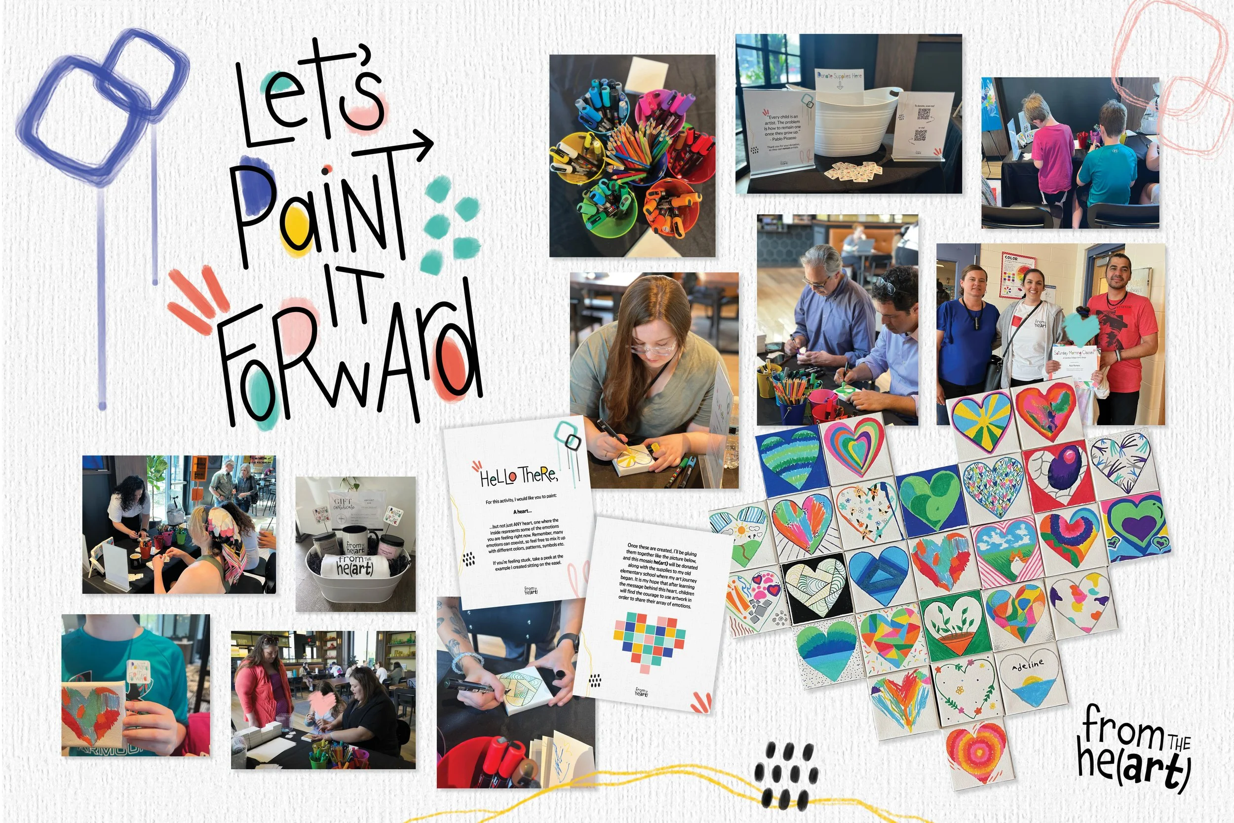
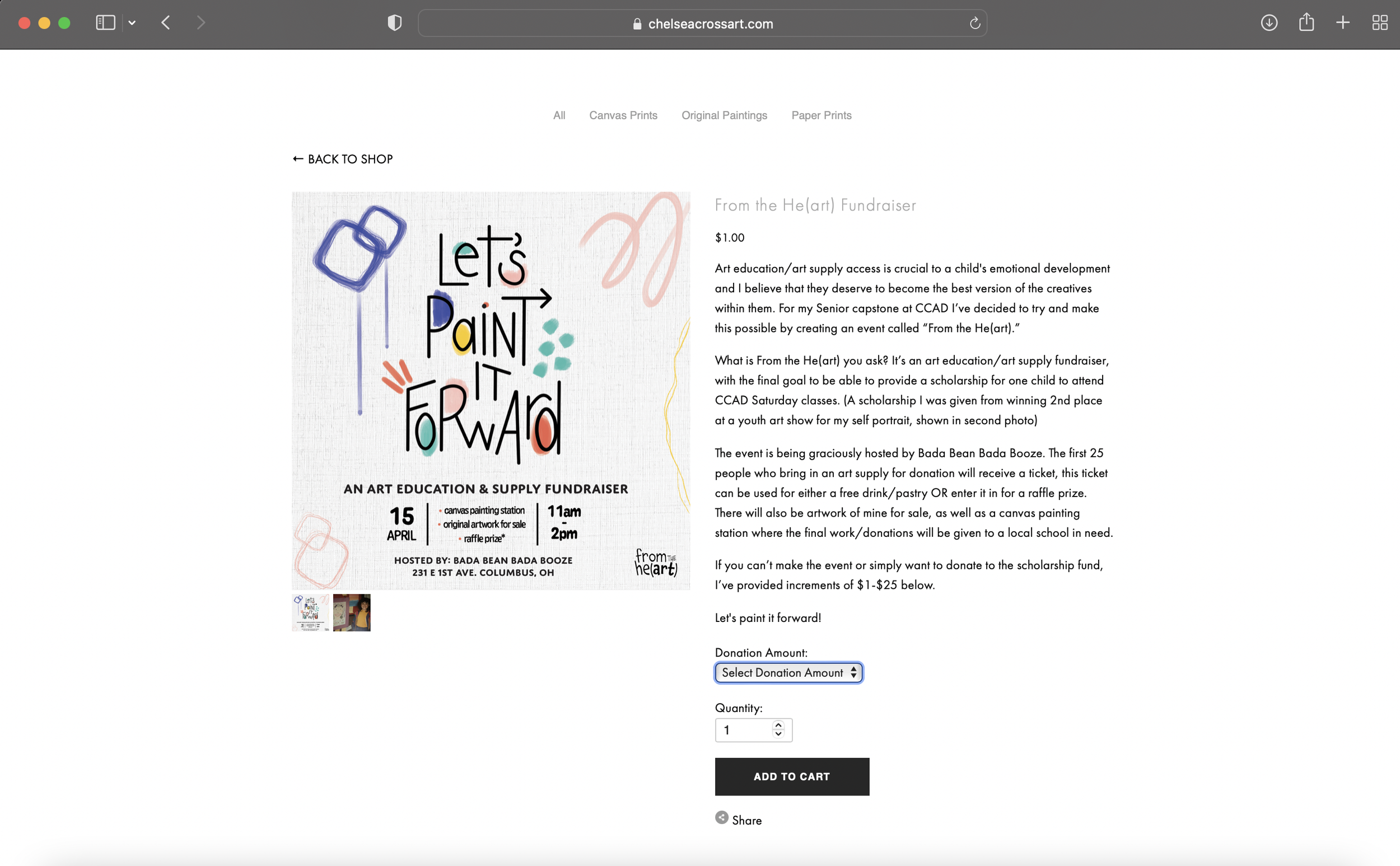
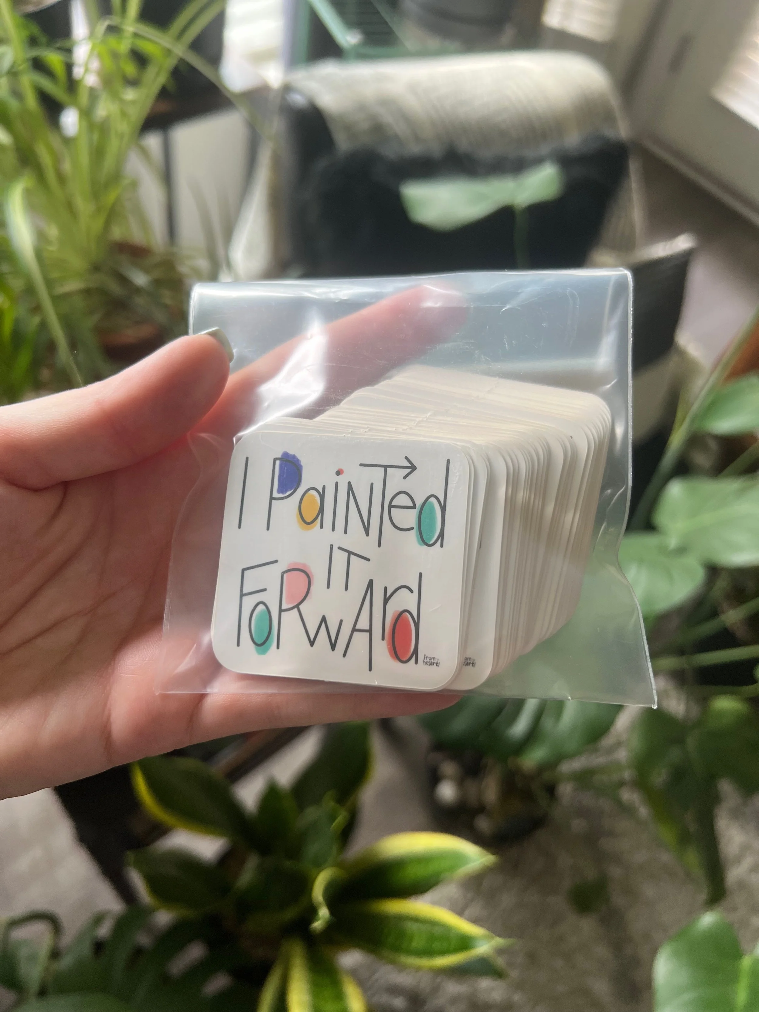
Allow me to introduce you to my Senior Capstone project called From the He(art). Art has always been such a huge part of my life. When I was a child I was given a scholarship to attend Saturday Morning Art Classes at CCAD and it truly opened my eyes to where creating art could take me. I wanted to provide this same opportunity for a young artist, as well as give back to my old elementary school where my art journey began. I setup a donation page on here to raise funds for not only the scholarship but for art supplies to be donated, and within just a couple weeks, I was able to meet the scholarship goal. In addition to raising funds, I wanted to plan an event where people would get in the mood to paint it forward and also understand the importance of art access and art education. I created a prompt for my guests that asked them to put their emotions they were feeling that day and use colors, shapes, patterns, etc and put them into the shape of a heart on canvas. I later planned to glue all of these canvases together in a large heart, and donate it to my old elementary school so children could see how art can provide them a safe and secure space to share their emotions.
The event was hosted at Bada Bean Bada Booze, and the space provided the perfect atmosphere for art, connection and the sharing of emotions.
A student was nominated to receive the scholarship and it brought me absolute joy to be able to give, what was once given to me.
And, I was able to purchase quite a few art supplies that were needed by my old school with the additional funds raised.
Please take a look below for a closer view of some of my signage and social media content, as well as a video recap of my process, footage from the event and everything in between.


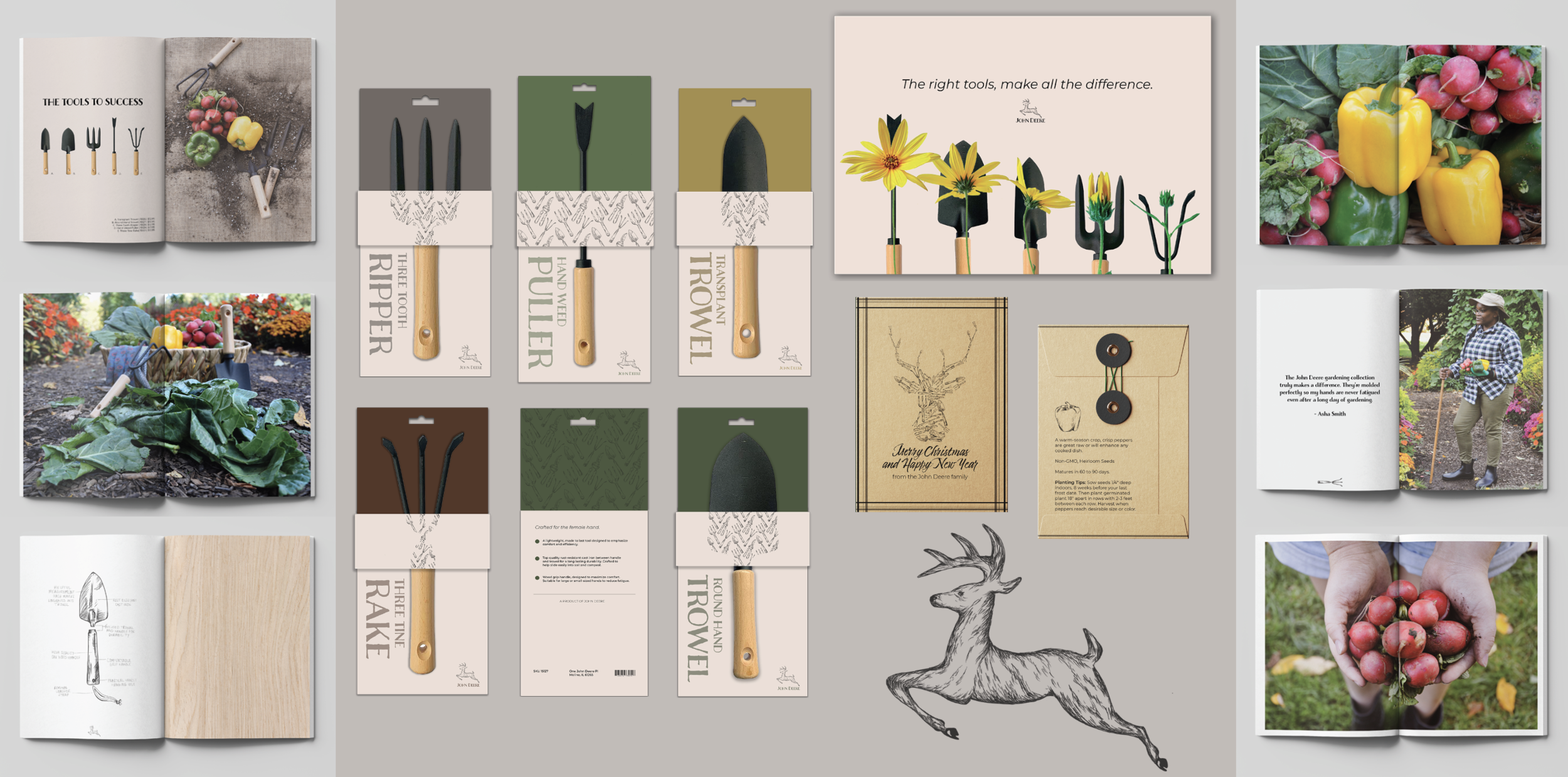
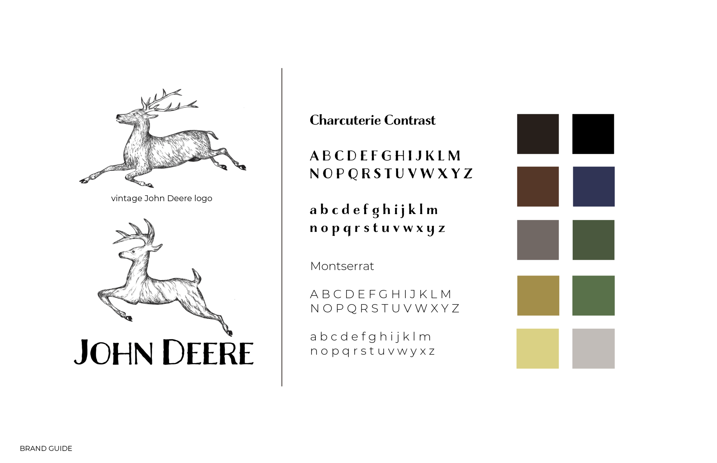
Multi Gold Addy and Best of Show Winning - John Deere Corporate Campaign - Swipe below for the process of how and why I designed a hand-tool collection campaign for John Deere.
Final Deliverables:
- Christmas Card Seed Packet
- Packaging
- Store Advertisement
- Lookbook
(All photography and sketches in images were done by me)


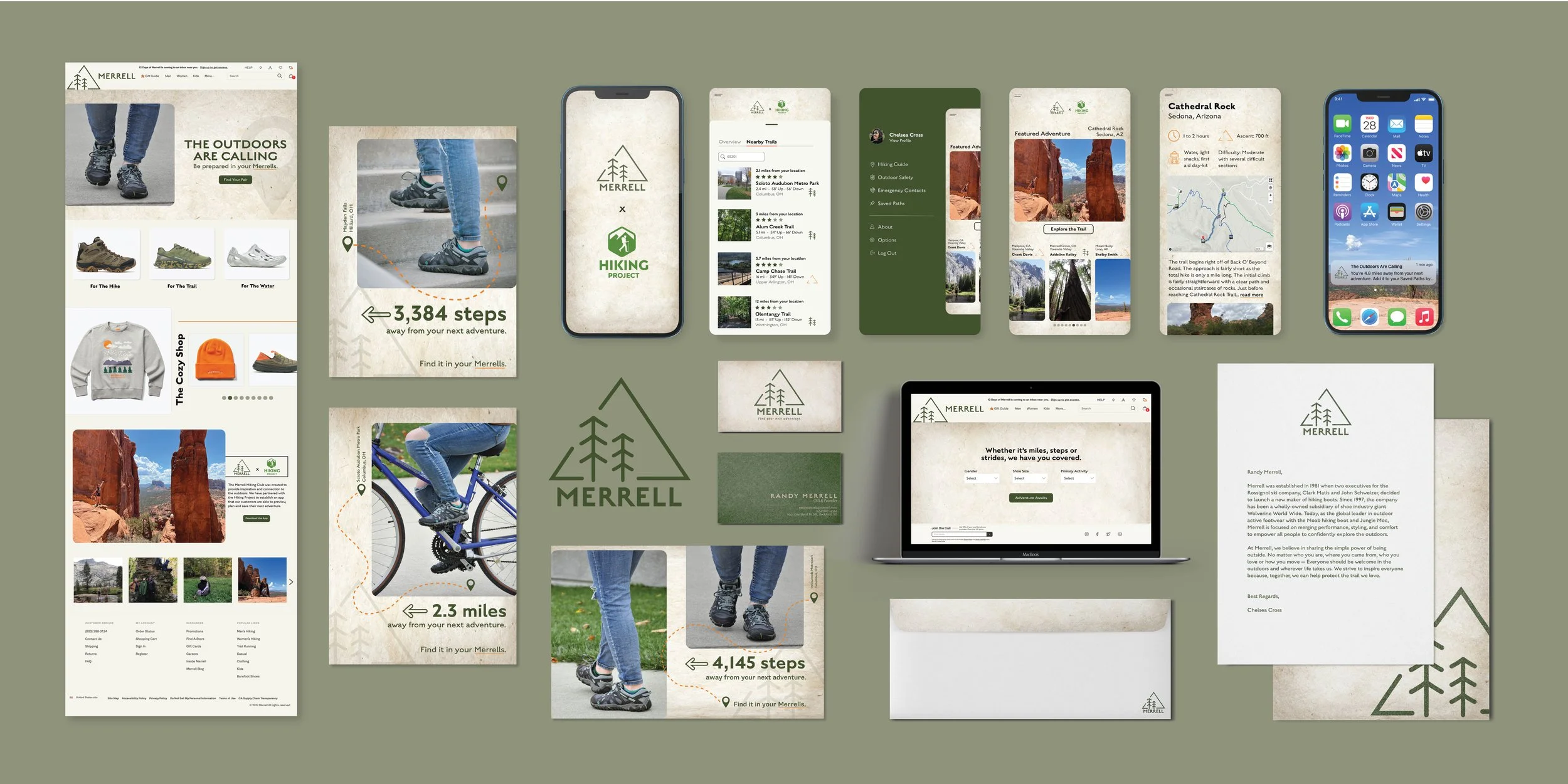
For this project we were asked to select a brand and re-design a few aspects. I love the outdoors and nature, so I chose the brand Merrell. While I love and own some of their products, I felt as if their brand identity could use a face lift. This project required multiple deliverables including: three print ads, website landing page (w/additional page including product, checkout etc.), brand guidelines (including new logo and typeface), and last but not least an app.
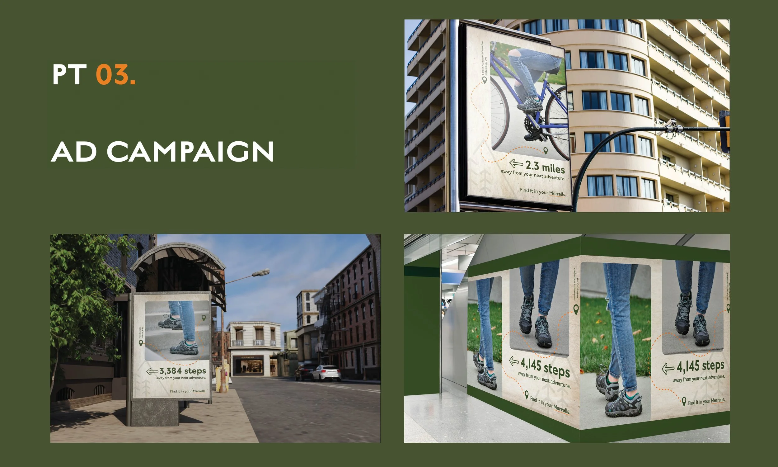
Print Ads - As far as the print ads, I was inspired by my Apple Watch and the consistent reminders of how many more steps I need to close my rings. My focus was show people that the steps they’ve taken in a day, could easily lead them to local trails and parks and they are much closer to their next adventure than they think. And, whether it’s a few thousand steps or miles, it can be “found in your Merrells.” Not only does this reduce the carbon footprint, it encourages people to get outdoors and enjoy what nature has to offer.
Logo - Inspired by the quote on Merrell’s site that read, “Merrell exists to share the simple power of being outside,” I wanted to create a logo that represents the simplicity and tranquility of experiencing the outdoors.The triangle represents two concepts simultaneously. Since Merrell prides themselves on sustainability, the triangle emphasizes the narrative of recycling. And, not closing the triangle allows for growth, whether that be for the trees or for the the Merrell customer. It shows that by wearing the brand, you can reach new heights, in all aspects.
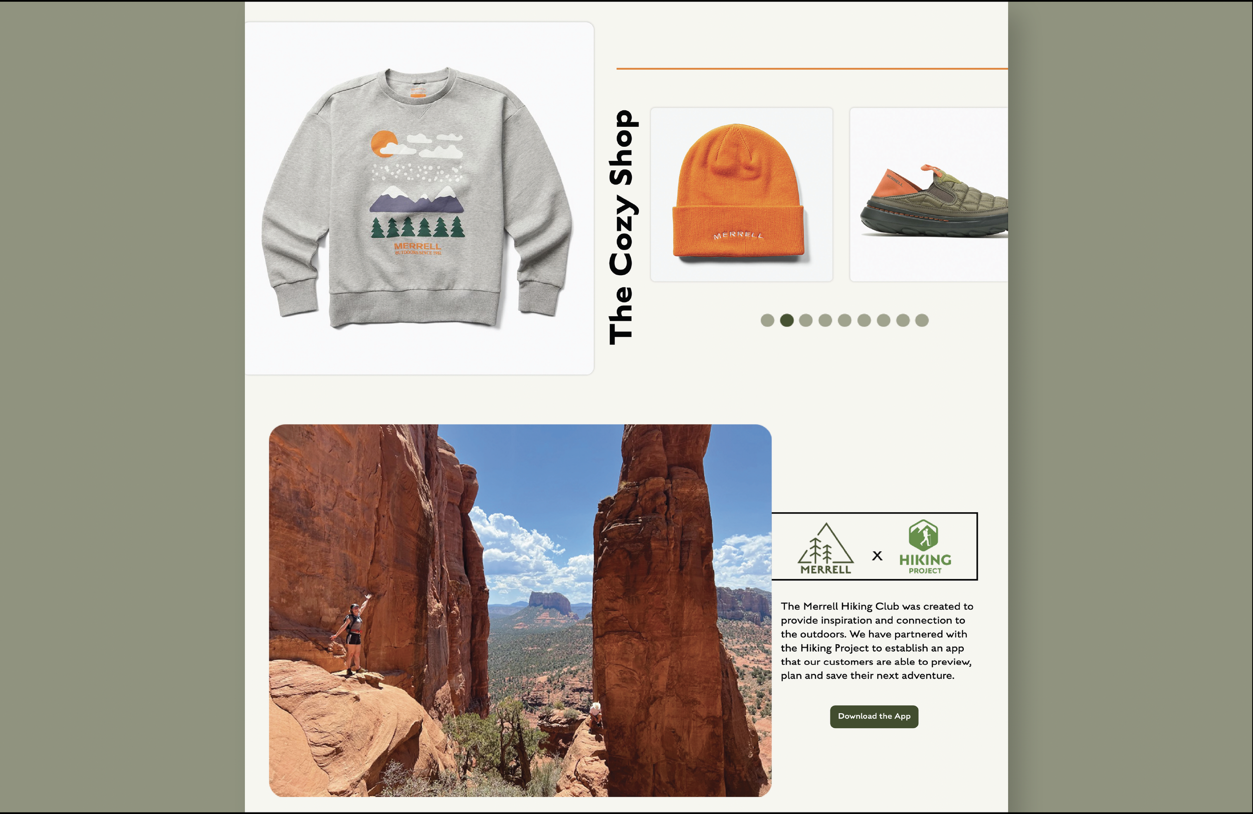
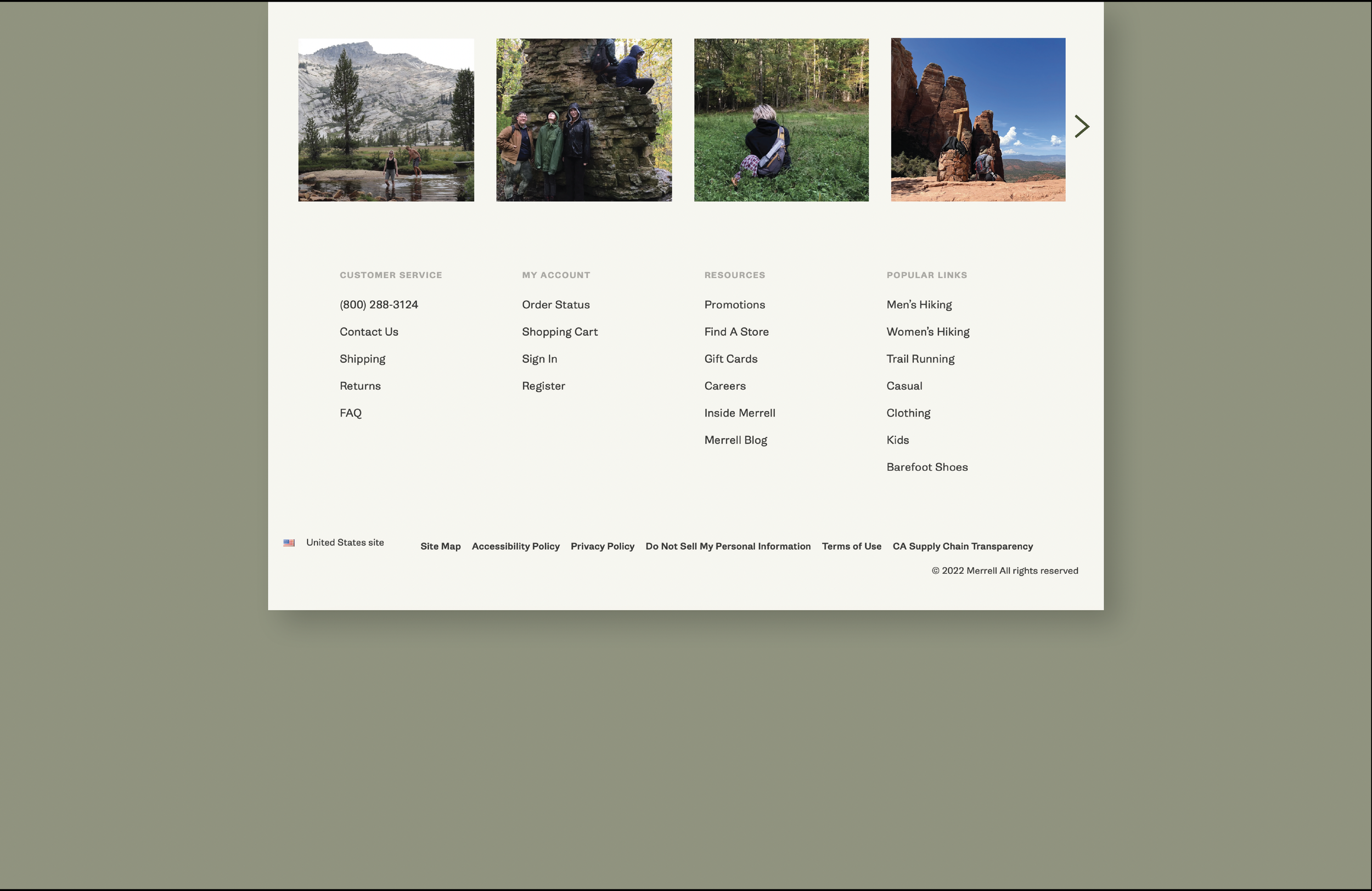
Website - I continued the same branding with type/background but added in specifics from the print ads like the pin drop and underlining of the brand name. This leads them down to the new app where Merrell has partnered with the Hiking Project. Currently Merrell has a hiking club but the only way to connect with the outdoor or other enthusiasts is by submitting an email.*
App - Merrell x Hiking Project is an app that shows you just how close you are to your next adventure. By downloading it from the website, you’ll be able to set up a profile, emergency contact, save trails or paths, see other people’s adventures as well as connect with other users and so much more. You can set your location to a specific radius, so that if you’re within a certain area, you’ll receive notifications stating “the outdoors are calling, you’re ____ steps away from your next adventure. Add it to your saved paths.” This app will also offer a map, information about the trail as well as what you may need to bring if planning to go.*
I hope you enjoy this project as much as I did. It has certainly inspired me to get outdoors more as well as use brands like Merrell that are more sustainable and quality made.
*All print ad photos were taken by me, however, photos used in app, and at the end of the website landing page were taken by and/or of Addeline Kelley, a fellow classmate of mine at CCAD and her adventures around the United States. She allowed me to use this for this project. Product photos were taken from Merrell’s website.


For this project, we were asked to promote a brand/organization, it could be a made up brand or an existing one. I chose to create a brand, and well a business that I felt would be extremely beneficial to the artists of the world.
“Preamato” means pre-loved in Italian. Not only am I of Italian descent but I am also an artist. I created Preamato for the artist who is starving to create but is lacking the funds to do so. There were times in my life where I wanted to paint, but simply wasn’t able to due to lack of funds and bills that took priority over my hobby. This organization would be similar to a thrift store only for art supplies. People could donate gently used brushes, pencils, erasers, paints, etc. and it would be sold at less than a third of the cost. So whether the customer was a beginner or someone who Is coming back to creating after a hiatus, they are able to do so, inexpensively. Some of my deliverables included:
- A website as well as an app to shop supplies. For my shopping experience example, I chose paint brushes and provided a description as to what kind of work they are best for, as well as the strokes you can create with said brush.
- A social media page/account that offered tips and tricks, how-to video, stories with customer statements about the brand, as well as when they were having sales or had new arrivals.
- Packaging for the supplies themselves made out of recycled paper, cardboard etc.
- Packaging that items are shipping in, as well as a card with a special message to artists.
I hope one day this organization could become a real business. I can’t explain how many people would benefit from discounted supplies during a time of severe inflation. Like I mention in my manifesto, “I believe that everyone deserves the opportunity to become the best version of the creatives with them.”
Swipe below for an up close of all my deliverables.


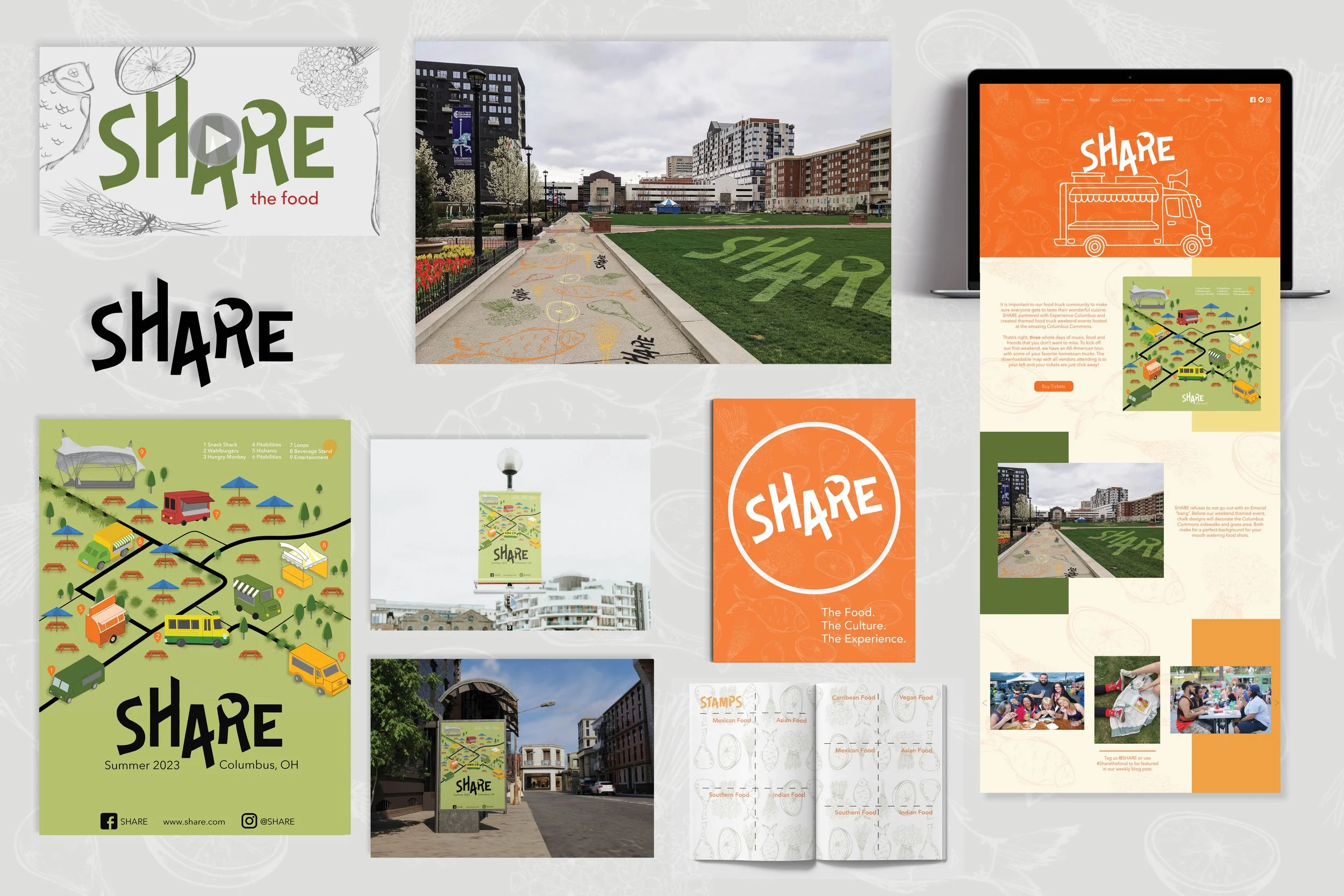
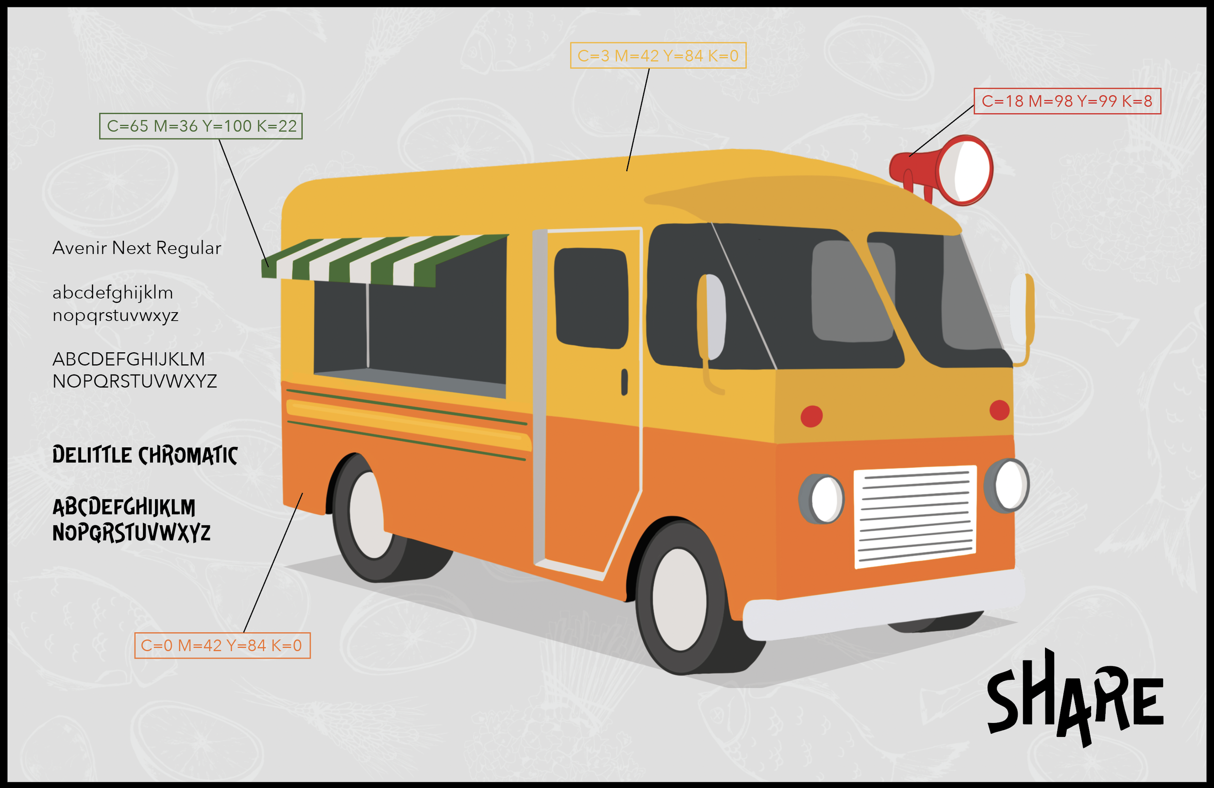
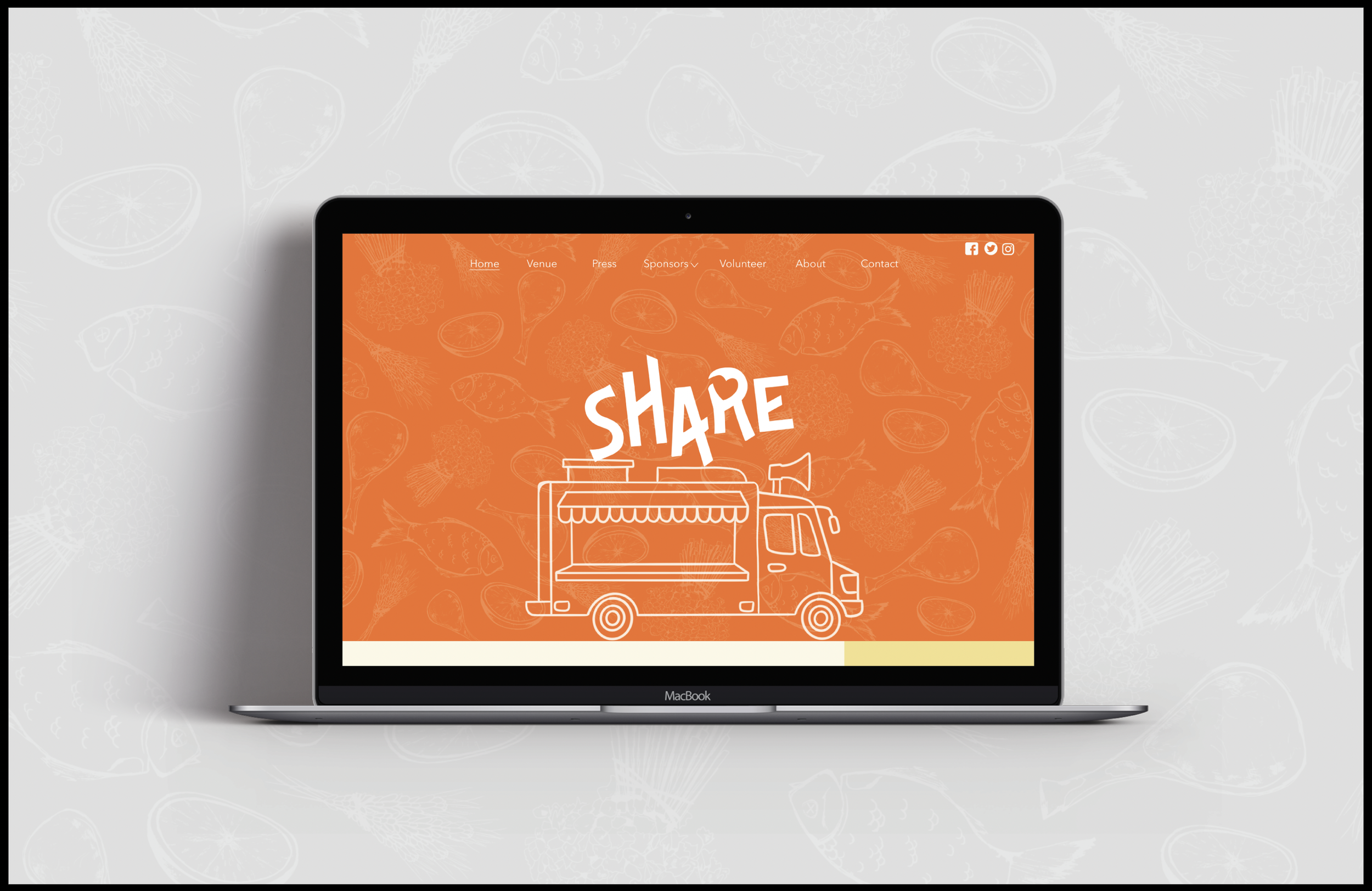
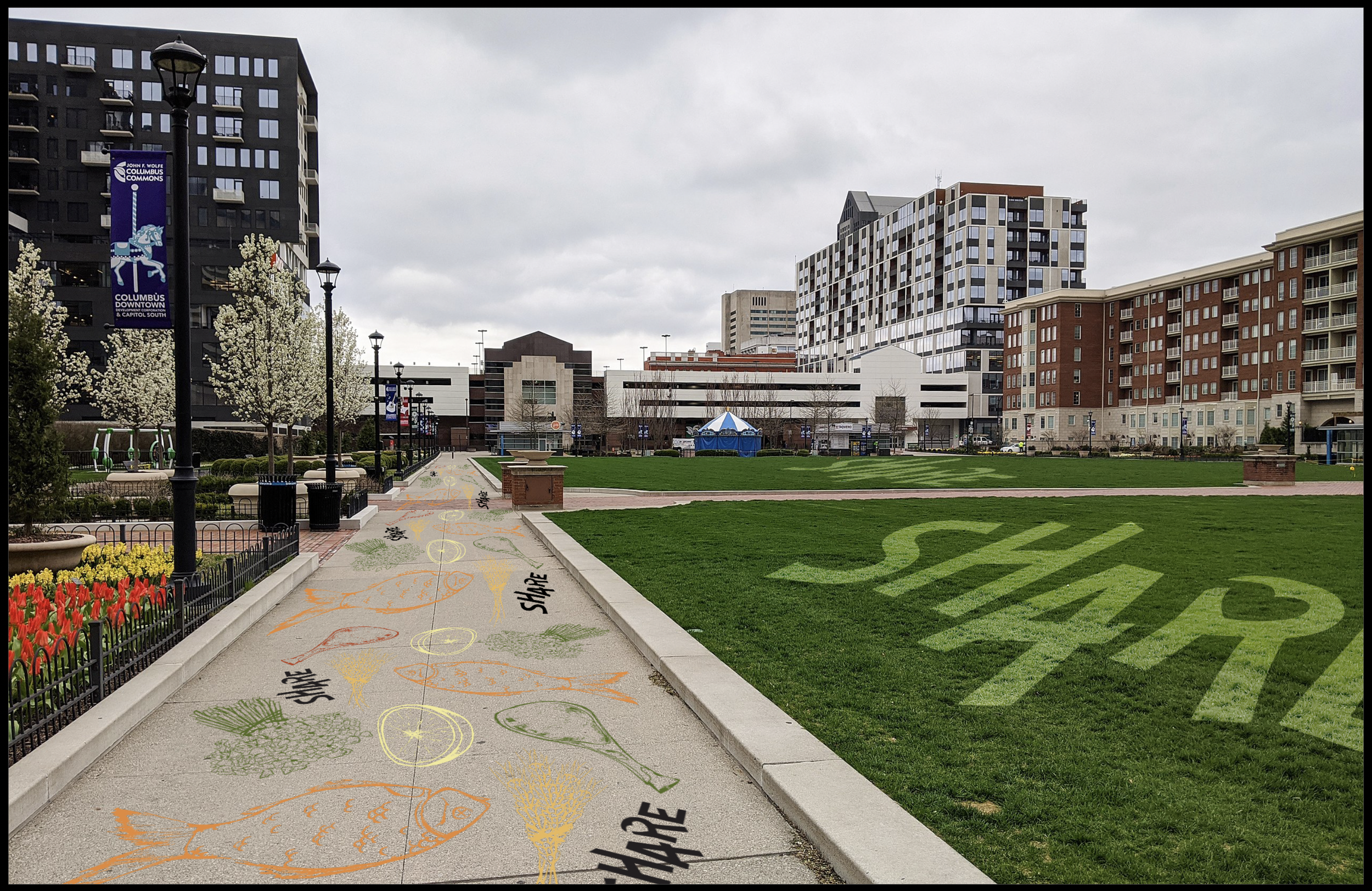
The SHARE Project
Share the food, share the culture, share the experience.
For this project we were asked to create a campaign for our local food truck festival that takes place every year. Our current food truck festival is large, and guests can sometimes become overwhelmed with the amount of choices, long lines and a large crowd. A friend, as well as classmate, Addeline Kelley and I decided to pair up to tackle this prompt. We renamed the festival Share, and narrowed down the food choices so that guests could truly experience the food, the culture and the time they spend taking part in community activities. To allow for a better experience…
- We created a poster, that also doubles as a map, listing the trucks that would be attending and their exact location. It could be used as a flyer, bus stop ad, social media post and so on.
- We also designed the logo by changing up the typeface a little in order to make a heart in the R.
- We used our branding to create a website homepage. And the pattern you see throughout our project doubles as our sidewalk and grass art for where the festival would take place.
- To allow our guests to make note of their favorites, we also created a passport that would be given to anyone who attended.
- And last, but certainly not least, we created a stop motion video showing two friends sharing a burger and fries, while being able to spend time with one another.
Swipe below for more pieces that made this project so special as well as our video.


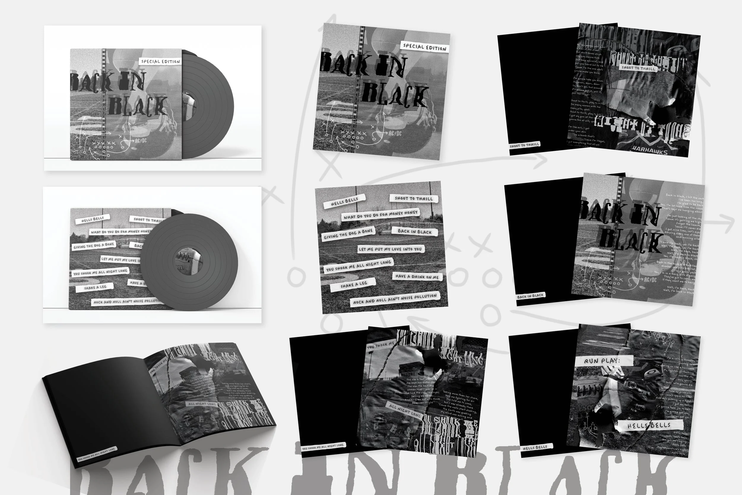
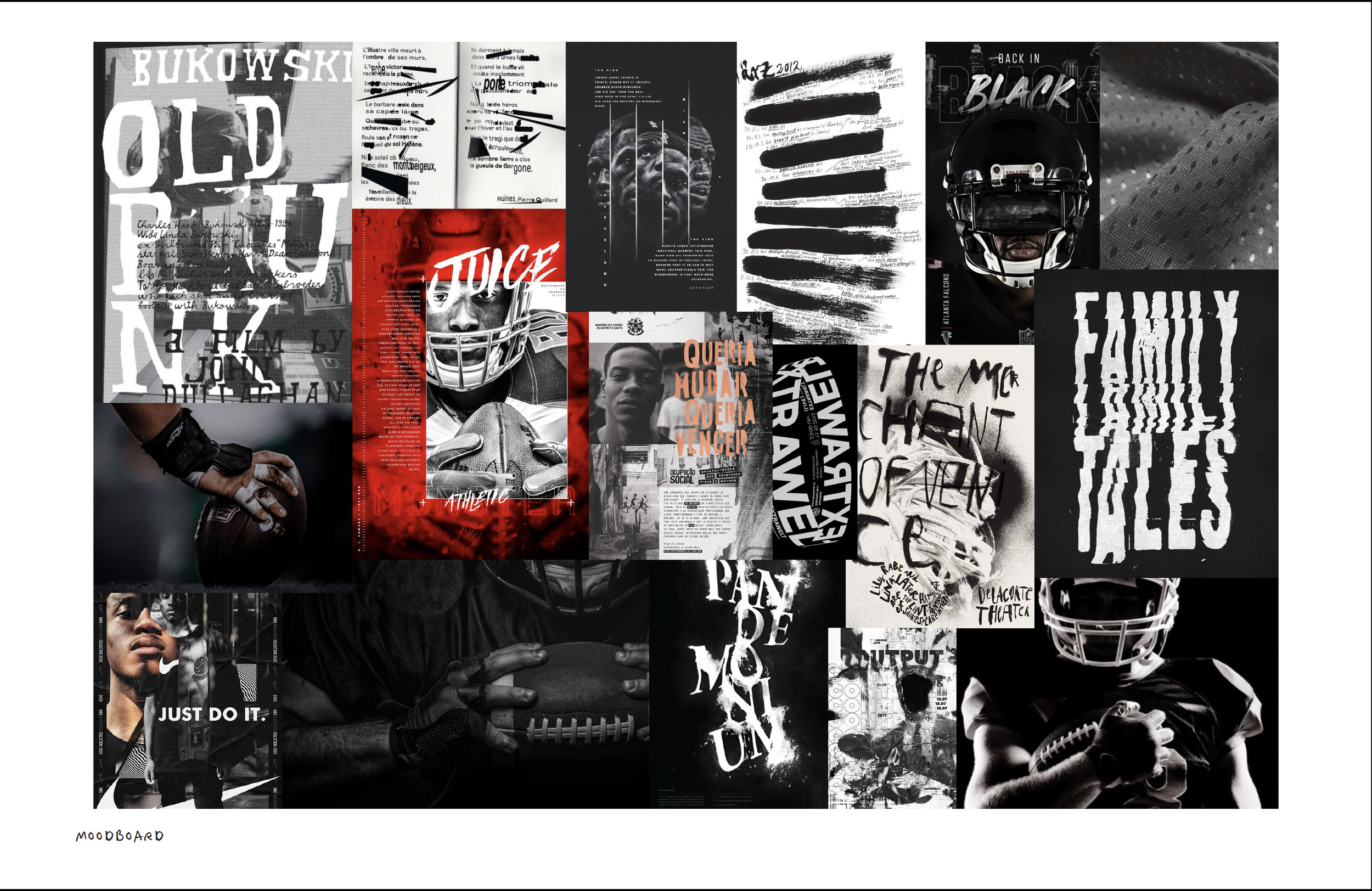
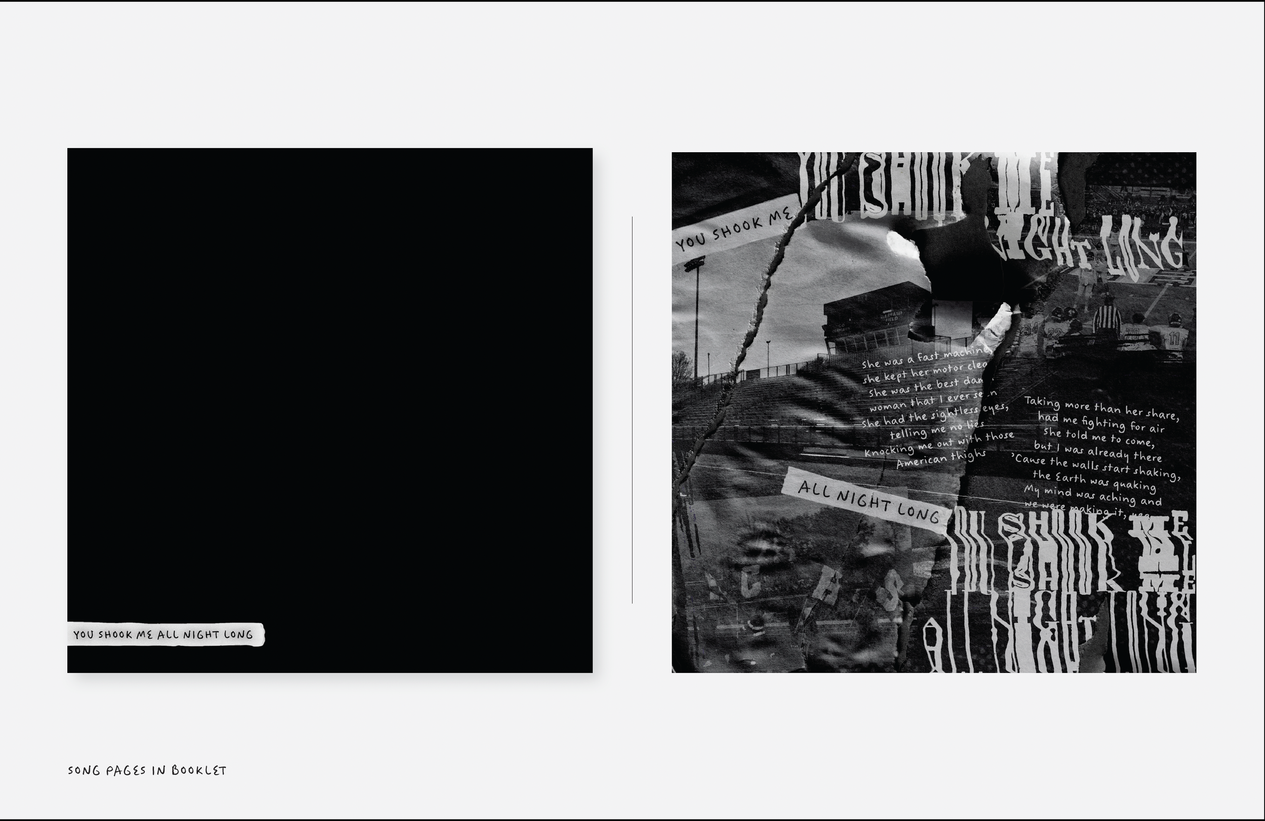
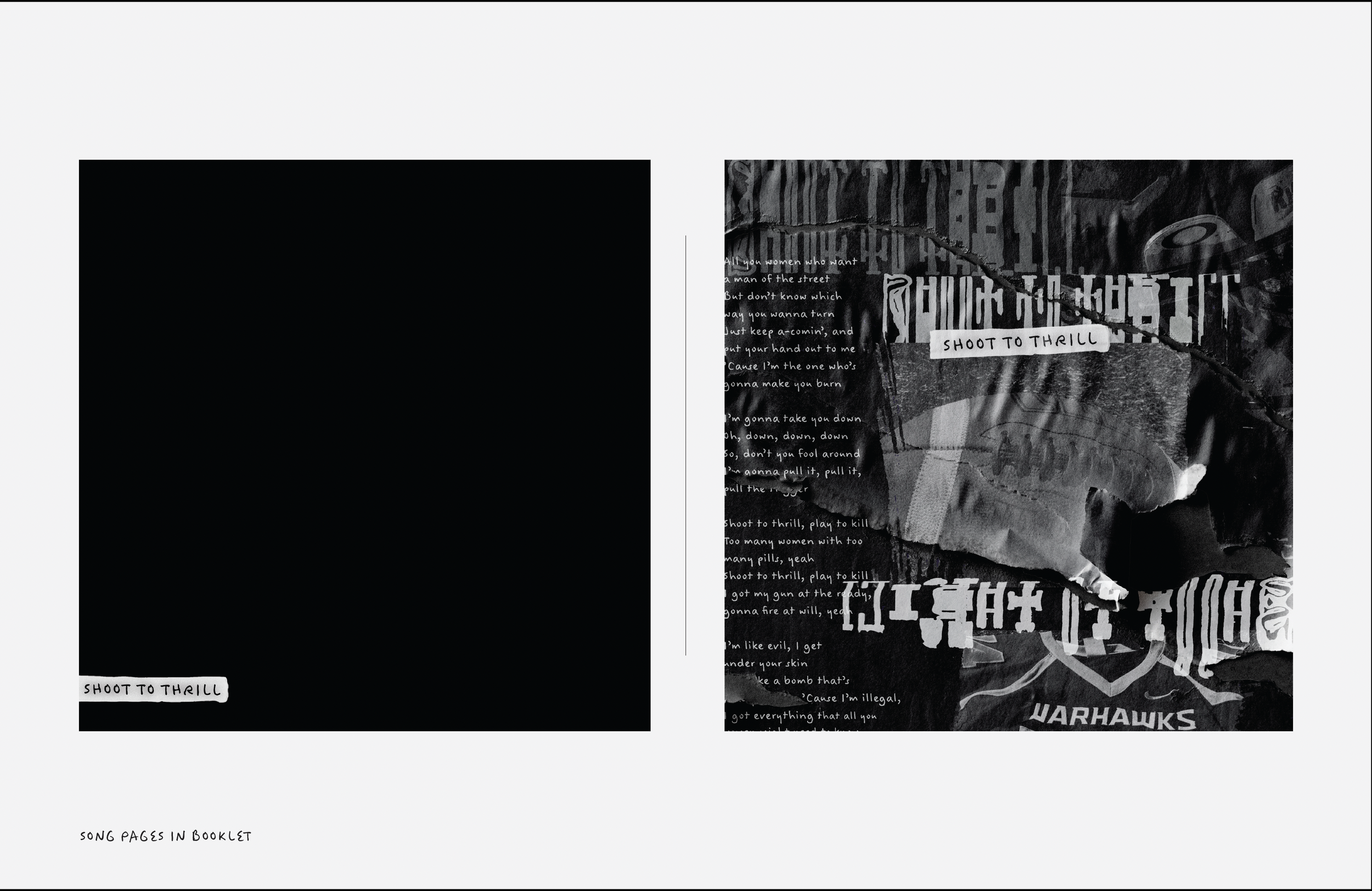
For this project we were asked to re-design an album cover as well as create print ads and social applications. We were to do this by using type expression, photography, and any other elements that we saw fit. I grew up being a football coach’s daughter. The rock band AC/DC was consistently played on highlight tapes (you know, back when VHS were a thing) so, I’ve always connected football and AC/DC. I decided to use their Back in Black album, and create print pieces that implemented both football and their lyrics. I photographed footballs, helmets, jerseys, the field, games in action and so much more. I wanted this project to be as gritty and rough to represent the game of football and black & white/greyscale, to follow the name of the album. This project was a true work of love, not only for football but how big of a fan I am of my dad, and his journey as a Hall of Fame coach.
My deliverables include:
- Front vinyl cover
- Back vinyl cover
- Booklet insert containing multiple print collages
- Two promo videos for the album
Swipe below to see these up close as well as scroll down to see both videos.


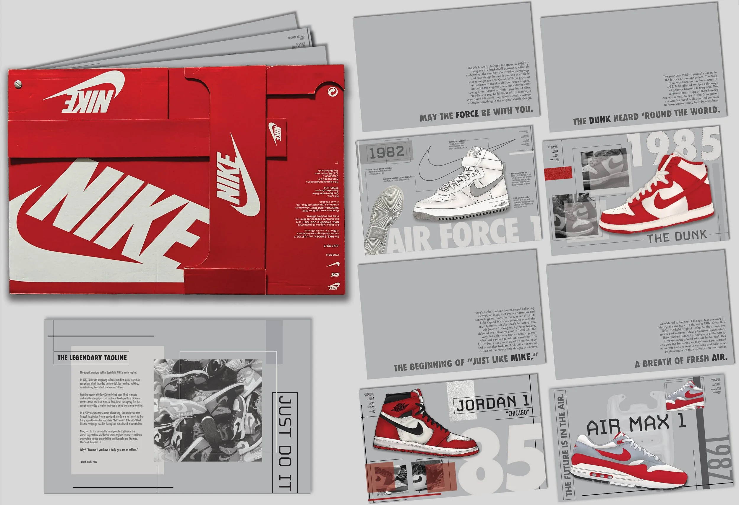
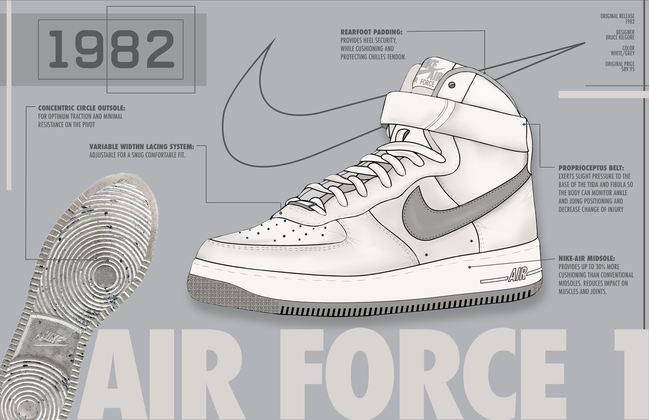
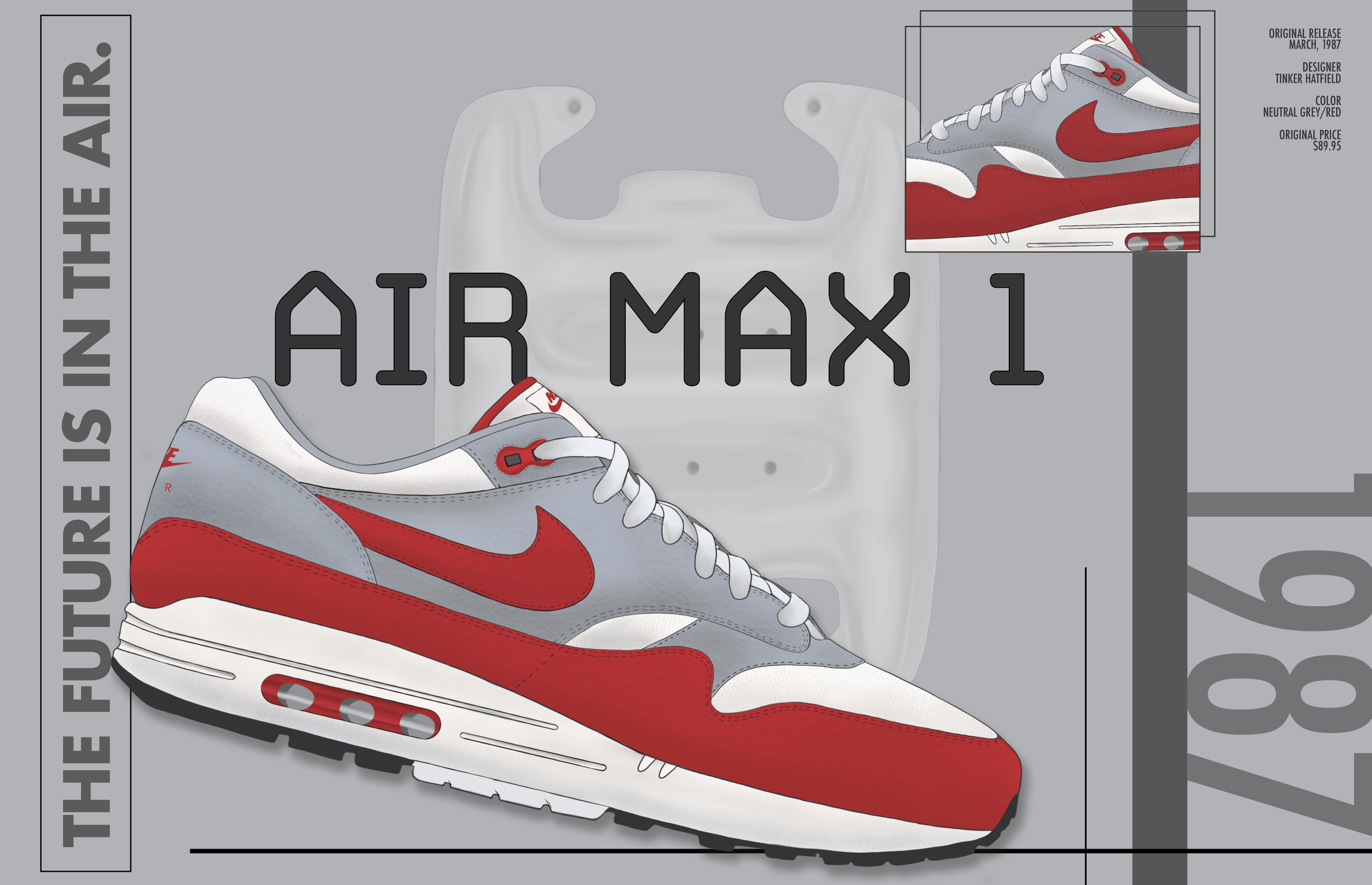
Nike Poster Lookbook
I decided to show some of the history behind Nike’s sneaker culture. I chose four of the most iconic designs and provided a history excerpt behind each one with a matching poster. The cover is made of an old Nike box that I cut and glued together in a unique fashion. To create the real life book, I punched a hole in the corner of each page and used a small grommet to hold them all together so you could spin through it like a swatch book.
This project won a Student Silver Addy in 2022, the work was created in the Fall of 2021.
I hope you enjoy it as much as I do.
**Product details in Air Force poster taken from information researched from Nike and some information from Sneaker Freaker Book. Article summary from first page is from as listed, Brand Minds, written in 2005.


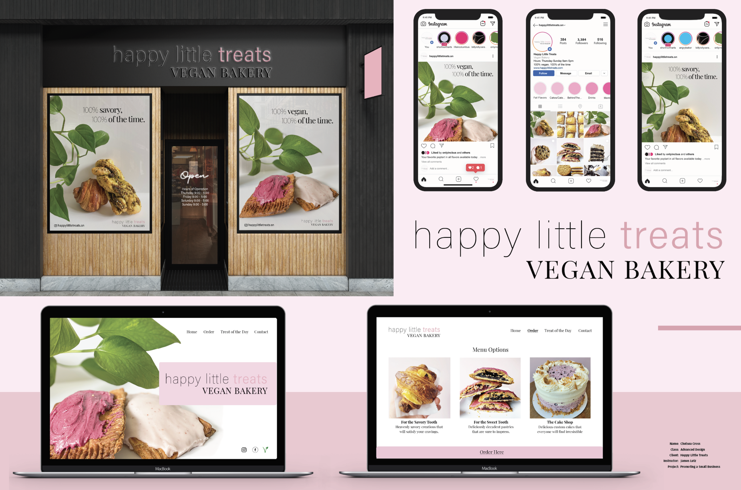
Promoting a Small Business (Re-Brand) - We were asked to find a local, small business that was in need of a re-vamp. Happy Little Treats is an amazing, vegan bakery that had recently re-located and I wanted to bring out the adorable pink the inside is painted in, to the outside (literally). I focused on photographing some of their most famous treats, on a clean, white background to incorporate throughout their social media, website and store front. By doing this I believe it gives a more cohesive look to their brand. Take a look at more in depth images from this project below.
Final Deliverables:
- Store Front Re-Design
- Social Media update
- Website Re-Design
(Poster photos in store windows taken by me, some photos added in website/social media are originally taken from HLT instagram account)


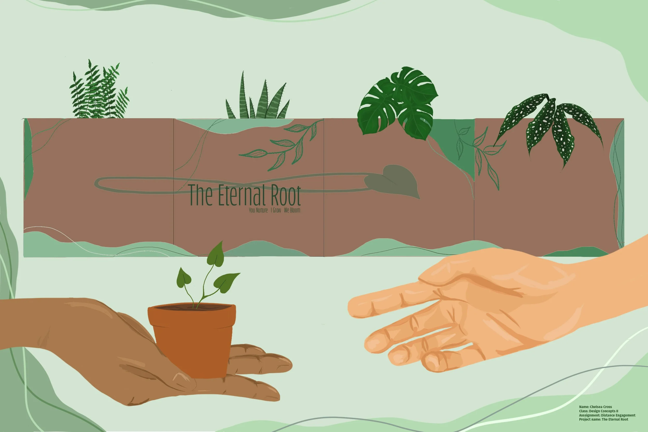
Distance Engagement Project - The goal of this project was to create something that would allow others to engage from a distance. Many people living in hospice, whether young or old, feel alone or lonely. Besides the visits from family members, loved ones and/or nurses, the quiet can be rather deafening.
My idea for this was to create a plant kit called The Eternal Root, that allows an individual to:
- Have something to nurture (You Nurture)
- See continuous growth (I Grow)
- Offer a sense of purpose (We Bloom)
Swipe below for more illustrations from this project.


Editorial Design - Swipe below for an up-close of each spread.


